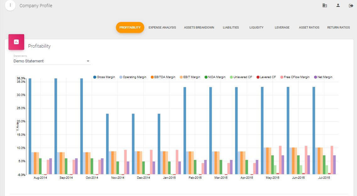
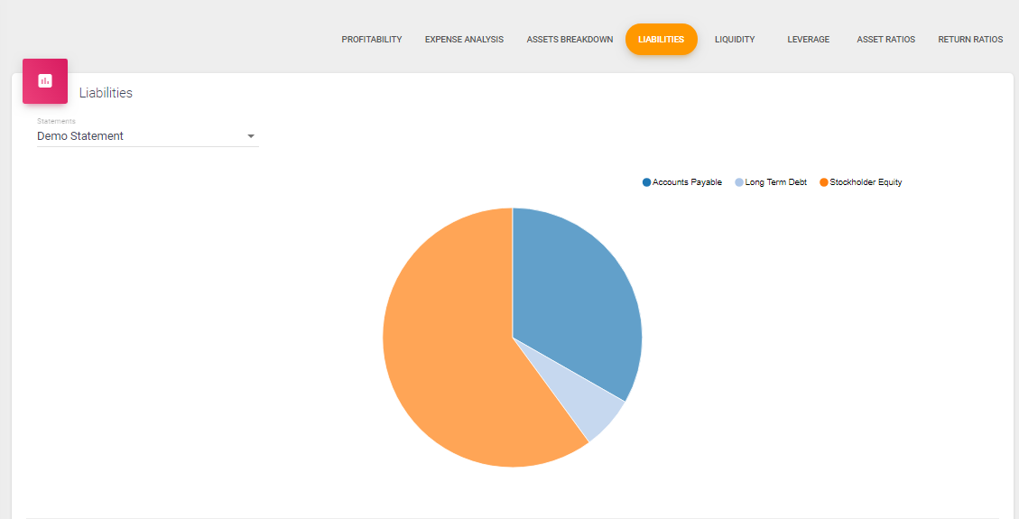
Financial Ratios Chart Options
Some of the charts in Financial Ratios and Benchmarking have view options located in the lower right of the chart.
Bar Chart: Represent the average data for the ratios. For example if your statement is 3 years of historical data. The Profitability Bar Chart represents the 3 year average of the profitability ratios.

Pie Chart: The Pie Chart option is available for Common Size ratios where the ratios add up to 100%. For example in Asset Breakdown, each ratio is a percent of total assets and all the ratios are 100% of total assets.
Trends: The Trend Chart represents the ratios for each period in your data. For example, if your statement is 12 months, the Trend Chart will display the ratio calculations for each month.